Showing posts with label renaissance art. Show all posts

Monday, May 25, 2009

More Good Stuff


Once again I’ve found a beautiful piece of Randall Good’s work that deserves mention here on the blog. Of course, I would love to review each and every piece of work that he creates, but that would be a little time consuming. This piece is a drawing I acquired for a friend’s birthday present. He admired it at the last gallery walk we attended at Blue Moon Art Gallery in Hot Springs. I generally need very little excuse or persuasion to buy Randall’s work. I love it all.


This piece was untitled but I’m sure it could be called, “Christ Victorious”, or “Christ Triumphant”. Another interpretation might be a highly stylized ascension. The work is a graphite and white chalk drawing on a gray tinted paper support. Once again, Randall left a beautiful white deckled edge lending to the suggestion of an old parchment. The sense of Michelangelo’s or Da Vinci’s Renaissance works is prevalent again. This work was floated over gray mattes to compliment the tone of the support. The fully framed dimensions are 14X21 inches.


This work is a striking composition and succeeds on a number of artistic levels. As a balanced composition it appeals because of the contrasting elements of the organic and dynamically posed body countered by the static and geometric form of the cross. The drapery is energetic and wind-swept while serving a primarily decorative and ornamental purpose. The dominance of the cross in the upper left quadrant is countered nicely by an abundance of twisting fabric held in Christ’s hand and in the lower right corner. Randall’s sense of line and movement gives the viewer’s eye a number of paths to follow through the work. The lovely S-shaped serpintinato of the body projects upward, the diagonal of the cross moves left to right, the billowing curvature of the drapery encircles and frames the figure. It all works together to create a vigorous amount of activity in what could be a very static and stationary posed figure. One is reminded of Michelangelo’s David when looking at the bent knee and counterbalanced angled hip.


In analyzing the work one must question its purpose and meaning. At its essence, is this a spiritual work or a decorative one? Is this a religious work celebrating Christ or is it an ornamental work using the imagery of the Christ figure as decoration? Could it perhaps be both? Most religious works display the Christ figure for the purpose of narrating the His message and ministry. The crucifixion describes the story of the Passion. The resurrection shows His victory over death. The ascension demonstrates His separation from earth and habitation of heaven as a divine being. But, this work causes us to question which event is being portrayed. What is the story or message here? Is it simply a tribute to Christ as a physical being?


In this work, Christ is not nailed to the Cross. He embraces it as a symbol. Without it the viewer would be hard pressed to identify the figure as Christ. Perhaps this is an interpretation of the Resurrection. The billowing drapery might be the linens used to wrap His body. In the powerful force of reanimation He is liberated from them and they become more symbols of His victory and defiance over death. However, the drapery does little to cover the nudity of the figure and serves an accessory to stylize the work. The figure stands on a swath of the billowing fabric as if He is being elevated by wind alone giving Him a light and ethereal presence.


When looking at the image it gives the feeling of celebration and joy. This figure, without the cross, could easily be the triumphal top of a modern-day athletic trophy. The pose is not unlike the victorious Athena Nike with the uplifted arms ascending into the air. All that is missing is the wings.I like that this piece provokes questions in the mind of the viewer. I like that Randall didn’t do all of the mental work and storytelling for us. He intelligently creates an image that allows the viewer to bring their own interpretation and overlay it on the beautiful template he provides, thus creating an individual meaning for everyone who sees it.

Sunday, April 20, 2008

Caravaggio Rocks

I'm currently reading about the Italian Renaissance artist, Caravaggio. I've always admired the dramatic pictures that he made. He created emotional religious scenes, lusty classical themes of pagan gods and most of them included beautiful young men as featured subjects. I always put him in the same classical category as Michelangelo, Leonardo, Raphael, etc. As a matter of fact, he was almost a contemporary of those guys. Lived just slightly afterward. What I'm just beginning to learn is that he had a rock star personality that rivaled his artistic talent.

The painting featured here is obviously an interpretation of Bacchus. He has the toga, the grape leaves wreath on his head and the obligatory cluster of gapes in hand. All that's missing is the bloated, gluttonous physique. However, I personally prefer this younger more muscular figure. I've seen this painting in art history books, encyclopedias, the Internet, for years. But, until I recently read a biography of Caravaggio I didn't know the whole story. This painting is actually a self-portrait. The drunken Bacchus in this picture is the face of Caravaggio himself.

It seems that Caravaggio was a real wild man of the art world. He got into a lot of trouble during his lifetime. He was always drinking, feuding, and brawling. It was only due to the fact that he had influential patrons that respected his work that he was able to avoid a lifetime of prison. He did spend his share of time in jail. It seems that he was always pulling a knife on someone, throwing rocks at them, you name it. It sounds like he was the Russell Crowe or Naomi Campbell of the art world. It didn't help things that he was frequently intoxicated and sick from drink.

I regret that because of his undisciplined personal life that Caravaggio died way before his time. His painting career lasted only 15 years. But I've been so glad to hear that this guy was a "real" person. There is no way to force him into the idealized role of academic Renaissance artist. He was perhaps one of the most original, talented, and creative of his time. But, he was just a regular guy.

Monday, March 31, 2008

Seated Faun


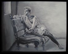
Here's the latest. I hope you like it. I'm calling it "Seated Faun with Lilac." It's a very pretentious title, don't you think? There are things I like about it and things I don't. We'll get into that later. What most of my viewers are going to be shocked at is the NUDITY. My apologies if you're offended. What you art lovers should be shocked at is my continuing lack of oil-painting technique.

This is an oil painting. As you know, I have worked mainly with acrylics. I'm also mostly self taught. So I'm learning from my mistakes. But, I'll explain what I was going for.

I've always admired the old Renaissance works of Caravaggio. You've seen some of those works with the dramatic chiaroscuro effects. His paintings of John the Baptist and Dionysus have inspired me. Basically, they are paintings of young men in pastoral settings. They usually feature dark backgrounds and golden skin tones with dramatic high contrast lighting effects. I know I can't match the quality of those masterpieces, but I wanted to see how close I could get.

I wanted the painting to have that same "Old World" look about it. So, I chose a photo reference taken in the mid-1800's by Wilhelm von Gloeden. I've previously painted a portrait using one of his photos as reference. I called it "Youth with Lillies". At that time I was painting with acrylics and didn't get the blending that I wanted. I was also trying for a Pre-Raphaelite style that I admire quite a bit. I fear that my mixing of styles and techniques may have been a hindrance for me in this painting. But, I'll let you be the judge of that.

I began with an oil sketch in umber. Bougereau called that a frottie. During this stage it was all about composition. I love using oil paints during this phase. Its so easy to wipe out and redo anything that's not going right. It's not necessary to commit to anything early on in a painting. With acrylics, they're dry within minutes. There's no way to wipe out, just paint over. That leads to a very unpleasant build-up of paint unless you're very accurate with what you're doing. Oils seem to be much more forgiving. I'm starting to realize why the great masters have always loved the oil medium.


Next I worked up the frottie with an opaque grissaille. Here's where I began to model the forms and refine the values in the painting. I like to think of this phase as "injecting light" into the painting. The frottie is a very transparent and "washy" stage. White paint, either titanium or flake white, acts like a light reflector under the colors. If its not obliterated by the subsequent layers it lends a painting that glowing effect that seem to mystify the viewer. I love working on this layer. Its such a challenge to establish a sense of realism using nothing but light and dark. You also have to be careful not to lose the original composition as you work this up.

The next layer is the first application of color. I don't like using black in my color layers to modulate value, so I try to work with compliments to create various neutrals. I've experimented with a couple of techniques with color and I've decided that this method works best for me. As a matter of fact, I tried a different color process on my current painting and I'm not getting the results I want. So, I'm going back to the primary and compliment process.


Since I wanted to get a "classical" look, I put the background as a deep ultramarine blue with viridian and sienna to intensify it. The old masters did this because blues were so flattering as a compliment to golden skin tones. I started my colors with a pale white and ochre skin tone with dioxazine violet as my shadow. It really makes the contrasts pop. But, we all know that skin doesn't really look like that. So I needed successive layers. I started to refine the details of the face. I'm also experimenting with leaves and bushes for the background. Its not very imaginative at this point. The flower in his hand is the focus of his gaze. I know I'll eventually have to do a good job on that or it will seem unimportant. I'm beginning to see already that I've lost the structure of the hand and feet. That's always a danger when overpainting as many layers as I do.


In the subsequent layers I begin to work the contrasting values and more intense hues. I use more opaque white in the color to get the high points and a transparent smoky gray created from ultramarine blue and sienna to deepen the shadows. I decided the background lacked interest so I inserted a tree and couple bushes with more reflective leaves on them. I decided to make the flower in his hand a lilac because that's kind of easy. Its a bushy purple flower that can be splotched in without a lot of expertise. There was no way I was going to detail that dainty little thing he was holding in the original. I'll learn to do that some day but not for this painting.


I began adding more pinks and oranges to the skin tone. After a few days of drying time I detailed the hair and face and added a few bright white highlights to the forms. I'm happy with it. I feel its pretty successful for an amateur such as myself. Look at the close up of the face detail and you can see for yourself how much TLC I gave to this painting.


All that's left now is the signature and the varnishing. I hope everyone is pleased with this. I can tell you there were times I became very frustrated with this painting. But, every time I thought about throwing in the towel on this, I would think about the model. No doubt, it was very scandalous in the mid-1800's when this young man posed for von Gloeden. We think that our culture is homophobic now? Just think about what it must have been like then. Out of respect for the model and photographer I wanted this to be a classy piece of work. Both the model and photographer have been dead for almost 100 years now. I hope this little painting will serve as a homage to their work.

Sunday, September 2, 2007

Supporting "Real" Art


A friend recently referred me to an online article about research into some of DaVinci's painting techniques. He is aware of my interest in Renaissance artists and thought I would enjoy the article. When I wrote my thank you note for sending the article, I found myself writing my thoughts about our current place in art history. I think I learned a little about myself when I wrote this. I had never quite organized my thoughts about contemporary art in this way. I'll share them with you and invite your feedback about your own opinions regarding "modern art".


I'll begin by posting a link to the original article about DaVinci.
(This picture attributed to Reuters news service)


Here are my thoughts after reading the article:

"Its interesting that so many artists that have become the most appreciated
painted in this layering, canvas-mixing technique. Another artist (a favorite of
mine) that painted in a similar technique was American illustrator Maxfield
Parrish. He painted with only one pure pigment on each layer without mixing them on the palette. He allowed the combined transparent colors to modulate the reflected light to create his images. (Here's an online essay that explains how he did it "Maxfield Parrish")

Pure pigments create brilliant, intense images. Paintings created in this fashion appear to glow even in minimal lighting. Mixed colors get dull and neutralized in their intensity. This amateurish mixing of incompatible colors on the palette is one reason that modern artwork is missing the brilliance of the old works. Working in this style was an important
technique to master back in the days before modern chemistry made lots of subtle colors available through commercial oil paints. The Modernist movement of the early 20th century almost destroyed/supplanted artists that knew how to do this. So, now we're having to do scientific investigations of these old paintings in order to learn how these old masters got the results they did. There's a great website called Art Renewal International that supports the efforts of artists that are trying to maintain the legacy of legitimate art history. It supports artists that use traditional established techniques and methods rather than painters who gain attention just through sheer sensationalism. I'm including a link to the ARC website. Its very informative."

Art Renewal