
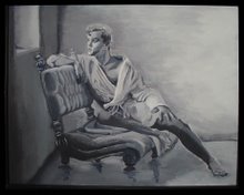
Here's the latest. I hope you like it. I'm calling it "Seated Faun with Lilac." It's a very pretentious title, don't you think? There are things I like about it and things I don't. We'll get into that later. What most of my viewers are going to be shocked at is the NUDITY. My apologies if you're offended. What you art lovers should be shocked at is my continuing lack of oil-painting technique.
This is an oil painting. As you know, I have worked mainly with acrylics. I'm also mostly self taught. So I'm learning from my mistakes. But, I'll explain what I was going for.
I've always admired the old Renaissance works of Caravaggio. You've seen some of those works with the dramatic chiaroscuro effects. His paintings of John the Baptist and Dionysus have inspired me. Basically, they are paintings of young men in pastoral settings. They usually feature dark backgrounds and golden skin tones with dramatic high contrast lighting effects. I know I can't match the quality of those masterpieces, but I wanted to see how close I could get.
 I wanted the painting to have that same "Old World" look about it. So, I chose a photo reference taken in the mid-1800's by Wilhelm von Gloeden. I've previously painted a portrait using one of his photos as reference. I called it "Youth with Lillies". At that time I was painting with acrylics and didn't get the blending that I wanted. I was also trying for a Pre-Raphaelite style that I admire quite a bit. I fear that my mixing of styles and techniques may have been a hindrance for me in this painting. But, I'll let you be the judge of that.
I began with an oil sketch in umber. Bougereau called that a frottie. During this stage it was all about composition. I love using oil paints during this phase. Its so easy to wipe out and redo anything that's not going right. It's not necessary to commit to anything early on in a painting. With acrylics, they're dry within minutes. There's no way to wipe out, just paint over. That leads to a very unpleasant build-up of paint unless you're very accurate with what you're doing. Oils seem to be much more forgiving. I'm starting to realize why the great masters have always loved the oil medium.

Next I worked up the frottie with an opaque grissaille. Here's where I began to model the forms and refine the values in the painting. I like to think of this phase as "injecting light" into the painting. The frottie is a very transparent and "washy" stage. White paint, either titanium or flake white, acts like a light reflector under the colors. If its not obliterated by the subsequent layers it lends a painting that glowing effect that seem to mystify the viewer. I love working on this layer. Its such a challenge to establish a sense of realism using nothing but light and dark. You also have to be careful not to lose the original composition as you work this up.
The next layer is the first application of color. I don't like using black in my color layers to modulate value, so I try to work with compliments to create various neutrals. I've experimented with a couple of techniques with color and I've decided that this method works best for me. As a matter of fact, I tried a different color process on my current painting and I'm not getting the results I want. So, I'm going back to the primary and compliment process.

Since I wanted to get a "classical" look, I put the background as a deep ultramarine blue with viridian and sienna to intensify it. The old masters did this because blues were so flattering as a compliment to golden skin tones. I started my colors with a pale white and ochre skin tone with dioxazine violet as my shadow. It really makes the contrasts pop. But, we all know that skin doesn't really look like that. So I needed successive layers. I started to refine the details of the face. I'm also experimenting with leaves and bushes for the background. Its not very imaginative at this point. The flower in his hand is the focus of his gaze. I know I'll eventually have to do a good job on that or it will seem unimportant. I'm beginning to see already that I've lost the structure of the hand and feet. That's always a danger when overpainting as many layers as I do.
 In the subsequent layers I begin to work the contrasting values and more intense hues. I use more opaque white in the color to get the high points and a transparent smoky gray created from ultramarine blue and sienna to deepen the shadows. I decided the background lacked interest so I inserted a tree and couple bushes with more reflective leaves on them. I decided to make the flower in his hand a lilac because that's kind of easy. Its a bushy purple flower that can be splotched in without a lot of expertise. There was no way I was going to detail that dainty little thing he was holding in the original. I'll learn to do that some day but not for this painting.
I began adding more pinks and oranges to the skin tone. After a few days of drying time I detailed the hair and face and added a few bright white highlights to the forms. I'm happy with it. I feel its pretty successful for an amateur such as myself. Look at the close up of the face detail and you can see for yourself how much TLC I gave to this painting.

All that's left now is the signature and the varnishing. I hope everyone is pleased with this. I can tell you there were times I became very frustrated with this painting. But, every time I thought about throwing in the towel on this, I would think about the model. No doubt, it was very scandalous in the mid-1800's when this young man posed for von Gloeden. We think that our culture is homophobic now? Just think about what it must have been like then. Out of respect for the model and photographer I wanted this to be a classy piece of work. Both the model and photographer have been dead for almost 100 years now. I hope this little painting will serve as a homage to their work.


2 comments:
I think the finished one looks great
Good Job !!!
Awesome work. Love the theme...
Post a Comment