Showing posts with label male. Show all posts

Sunday, November 9, 2008

My New Muse


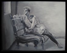
Gemini Art is finally getting back to making and posting artwork. This is my first drawing since the move so its very special to me. Its also special to me because the subject is one of the new friends I’ve met here. He was very generous to allow me to use a photo of him as a reference for this drawing. I generally use references found online of celebrities and such. This is the first drawing I’ve made using a completely original model and photo that I’ve taken myself.

This drawing is based on one of the photos taken on Halloween night (see Helluva Halloween). The room was dark and my flash was over exposing most of the pictures. There was a lot of activity and most of the pictures were blurry. But, this one turned out okay enough to draw from.

I won’t reveal too much about the model here. I think we should respect his privacy. But, I will say that he has become the class sweetheart of our little supper club. Not only is he a beautiful guy, he’s also one of the friendliest and nicest fellas you’ll ever meet. I believe all of us are a little protective of him. He’s a truly lovely person and I’m honored that he allowed me to draw his picture. No matter how pretty the picture it doesn’t do justice to his sweet and friendly personality.

There are some great technical strengths to this piece. I’ve tried to incorporate more of Anthony Ryder’s techniques in this work. I’ve tried to make better use of the encapsulating line to bound the form. I like the look it gives. The work stands out from the page stronger that my previous drawings. I feel there execution of the ear and hair are the greatest parts of the face. The modeling of the arm and shoulder are much better than I’ve accomplished previously also. I worked the fabric folds differently than I usually do. Instead of simply drawing and shading, I used a lot more eraser work to highlight the folds.

Regrettably the likeness isn’t as accurate as I usually accomplish. I definitely missed on the angle and length of the nose. Had this been a commissioned portrait I would had to start again. I attempted to draw some of the vascularity in his bicep. But, one of the viewers thought they looked like scars. In the future I need to try a different technique or try for a more delicate execution of those features.

I hope you enjoy the work. Leave a comment if you like. Also, if you are acquainted with the model, send him your compliments.

Monday, March 31, 2008

Seated Faun


Here's the latest. I hope you like it. I'm calling it "Seated Faun with Lilac." It's a very pretentious title, don't you think? There are things I like about it and things I don't. We'll get into that later. What most of my viewers are going to be shocked at is the NUDITY. My apologies if you're offended. What you art lovers should be shocked at is my continuing lack of oil-painting technique.

This is an oil painting. As you know, I have worked mainly with acrylics. I'm also mostly self taught. So I'm learning from my mistakes. But, I'll explain what I was going for.

I've always admired the old Renaissance works of Caravaggio. You've seen some of those works with the dramatic chiaroscuro effects. His paintings of John the Baptist and Dionysus have inspired me. Basically, they are paintings of young men in pastoral settings. They usually feature dark backgrounds and golden skin tones with dramatic high contrast lighting effects. I know I can't match the quality of those masterpieces, but I wanted to see how close I could get.

I wanted the painting to have that same "Old World" look about it. So, I chose a photo reference taken in the mid-1800's by Wilhelm von Gloeden. I've previously painted a portrait using one of his photos as reference. I called it "Youth with Lillies". At that time I was painting with acrylics and didn't get the blending that I wanted. I was also trying for a Pre-Raphaelite style that I admire quite a bit. I fear that my mixing of styles and techniques may have been a hindrance for me in this painting. But, I'll let you be the judge of that.

I began with an oil sketch in umber. Bougereau called that a frottie. During this stage it was all about composition. I love using oil paints during this phase. Its so easy to wipe out and redo anything that's not going right. It's not necessary to commit to anything early on in a painting. With acrylics, they're dry within minutes. There's no way to wipe out, just paint over. That leads to a very unpleasant build-up of paint unless you're very accurate with what you're doing. Oils seem to be much more forgiving. I'm starting to realize why the great masters have always loved the oil medium.


Next I worked up the frottie with an opaque grissaille. Here's where I began to model the forms and refine the values in the painting. I like to think of this phase as "injecting light" into the painting. The frottie is a very transparent and "washy" stage. White paint, either titanium or flake white, acts like a light reflector under the colors. If its not obliterated by the subsequent layers it lends a painting that glowing effect that seem to mystify the viewer. I love working on this layer. Its such a challenge to establish a sense of realism using nothing but light and dark. You also have to be careful not to lose the original composition as you work this up.

The next layer is the first application of color. I don't like using black in my color layers to modulate value, so I try to work with compliments to create various neutrals. I've experimented with a couple of techniques with color and I've decided that this method works best for me. As a matter of fact, I tried a different color process on my current painting and I'm not getting the results I want. So, I'm going back to the primary and compliment process.


Since I wanted to get a "classical" look, I put the background as a deep ultramarine blue with viridian and sienna to intensify it. The old masters did this because blues were so flattering as a compliment to golden skin tones. I started my colors with a pale white and ochre skin tone with dioxazine violet as my shadow. It really makes the contrasts pop. But, we all know that skin doesn't really look like that. So I needed successive layers. I started to refine the details of the face. I'm also experimenting with leaves and bushes for the background. Its not very imaginative at this point. The flower in his hand is the focus of his gaze. I know I'll eventually have to do a good job on that or it will seem unimportant. I'm beginning to see already that I've lost the structure of the hand and feet. That's always a danger when overpainting as many layers as I do.


In the subsequent layers I begin to work the contrasting values and more intense hues. I use more opaque white in the color to get the high points and a transparent smoky gray created from ultramarine blue and sienna to deepen the shadows. I decided the background lacked interest so I inserted a tree and couple bushes with more reflective leaves on them. I decided to make the flower in his hand a lilac because that's kind of easy. Its a bushy purple flower that can be splotched in without a lot of expertise. There was no way I was going to detail that dainty little thing he was holding in the original. I'll learn to do that some day but not for this painting.


I began adding more pinks and oranges to the skin tone. After a few days of drying time I detailed the hair and face and added a few bright white highlights to the forms. I'm happy with it. I feel its pretty successful for an amateur such as myself. Look at the close up of the face detail and you can see for yourself how much TLC I gave to this painting.


All that's left now is the signature and the varnishing. I hope everyone is pleased with this. I can tell you there were times I became very frustrated with this painting. But, every time I thought about throwing in the towel on this, I would think about the model. No doubt, it was very scandalous in the mid-1800's when this young man posed for von Gloeden. We think that our culture is homophobic now? Just think about what it must have been like then. Out of respect for the model and photographer I wanted this to be a classy piece of work. Both the model and photographer have been dead for almost 100 years now. I hope this little painting will serve as a homage to their work.

Sunday, March 23, 2008

New Guy in Grissaille


Hey everyone. This will be brief. I promised that I would post more work soon. Here it is. As some of you may remember from previous posts, I have just recently started dabbling in oils. I've painted exclusively with acrylics for years. But, as I've studied and experimented I've discovered that I probably won't get the results I'm after unless I learn the oil medium.

This first picture is the initial graphite sketch of a subject that I thought was appropriate. I've had so many positive responses on this blog and on the Flickr site of the Blue Towel guy that I decided to return to the "towel" theme. Just so you know, I feel I missed on the likeness of the model terribly. However, the focus of this painting is not necessarily to create a portrait but to learn oil painting technique. But, I feel I got the body proportions fairly accurate and the hands and forearms may be the best I've drawn (except for blue towel guy).
The second picture here is the actual painting. It's a 16 x 20 black and white grissaille. I apologize for the quality of the photos, as usual. The lighting in my little painting room is terrible. My wall color really gets into the photos terribly. The pencil drawing is actually photoshopped and color corrected because the light was so bad.
Now, because I would rather point out my flaws rather than have someone else do it, here's the critique. I did a pretty good job with manipulating values and getting the forms modeled correctly. However, the light source is really unclear. I think the reference photo was probably lit with multiple light sources. But, it still created enough deep cast shadows to make an interesting composition. My backgrounds are usually pretty lame but I'm happy with this one. The towel is still very unrefined. I've intentionally left a lot of soft, lost edges throughout the work so that I won't have to commit to final decisions until later layers. I'm not happy with the face. I'm going to live by that artist motto that perhaps it will just "work itself out". If you get a hint of brown in this when you enlarge the photo, you're right. The underdrawing is a raw umber frottie. Let me know what you think of him.


Saturday, July 28, 2007

Echoes of Leyendecker 2


I hope that you read an article I wrote a few months back about the great American illustrator J.C. Leyendecker. I love his work and would like very much to be able to create work in that style.


After painting the "Pink Trunks" man I was very disappointed. I felt as if I had started out with a good idea but got further and further away from the original composition I had planned. The original idea was to work in a very soft and transparent style. I wanted a very romanticized and atmospheric piece of artwork. Instead, my piece was very hard and sculptural and solid. I think the end product was one hundred percent the opposite of the style I planned to create.


While the result was unintended I have to admit that its not unappealing. There are some strong points about this piece. The balance and symmetry of the figure is good. The treatment of light, shadow, highlight, reflected light, and skin tones are appropriate. But, why did I lean in this direction? I thought about what my personal tastes in figurative art were. I tried to remember what influenced me. My first love of art was the Renaissance master works of Michelangelo and Da Vinci. The sculpture of Michelangelo and Bernini. So, is there any wonder why my work might have that very modeled and sculptural look to it.


I've also just been reading a book about the great American illustrators, Maxfield Parrish, Norman Rockwell, and his mentor J.C. Leyendecker. I found some illustrations by Leyendecker and was struck by a few similarities between his work and mine. First of all, there is the very statuesque and stylized rendering of the figure. Secondly, I noticed the cool bluish reflected light on the legs. And finally, I see the strong, almost polished quality of the highlights on the skin.
Am I suggesting that my work matches the quality of Leyendecker? Absolutely not. I'm analyzing this piece with as much modesty as I can muster. But, I am trying to convince myself that the aesthetic that I achieved is one that has been previously demonstrated and widely appreciated in another era. It can't be denied that the beautiful male figures in Leyendecker's work were extremely stylized and decorative. He wasn't trying to show those men as hardworking All-American athletes. He was blatantly celebrating a fantasized, idealized depiction of beautiful men. Apparently the publishers and readers of the Saturday Evening Post were celebrating right along with him.


Leyendecker's athletes had a definite sensual vitality to them. They look waxed and ready to go onstage as Chippendale's dancers more than prepared for a rowing competition. Yet, in the 1930's this image had a certain innocence to it. In that day and age these figures could be admired as beautiful without being overtly sexual. If the same type of cover were on a magazine today it wouldn't be a painting. It would feature a photograph of near naked sweaty fitness models. Where's the "art" in that? When put that way, I'm proud to have painted a piece that reflects Leyendecker's style.

Tuesday, July 10, 2007

Record Hit Count on Flickr!!

Here's exciting news. I just checked my Flickr album. I have three pieces of artwork that have just past a landmark for my little album. "Gridiron Warrior","Poolboy", and "Ganges" have reached or exceded 100 page views each. I only hope now that everyone that viewed the photo would also go to the gallery site and make a purchase. Or, at least drop me an email and let me know if they like what they saw. But, I see progress. The future is bright.


Wednesday, June 27, 2007

New Artwork in Prismacolor


It's finished. Here is the completed colored pencil drawing of the man in a blue towel. It's 12X16 prismacolor on gray Artagain paper. I'm very proud of the way it turned out. I promise it looks better when actually viewed. My photography skills and inadequate lighting don't do this justice. It is not yet framed so it doesn't lay as flat as it possibly could. I hope everyone enjoys it and sends lots of feedback. This one's for sale. Its also the first one that I signed with the "Gemini Art" moniker. I've used that on the blog and the website so often that I thought I should stick it on artwork so people can use it as a point of reference. I'm tired of pencils for a while. I'm going back to painting for the next artwork.

Thursday, June 7, 2007

Art Gallery Web Page Upgrade


Just a taste of the new and improved look.

As all good artists know, one of the keys to great art is the creator's ability to self edit. Using that as a motto I've taken a look at the old Gemini Art Gallery site. Its dark, bizarre and unfocused. I don't like it. After visiting a lot of gallery sites with art that I like I've begun a re-design that has a look that makes me more comfortable. I'm looking for two things in the new design. First, I want a more relaxed and inviting presentation. No modern, edgy, mysterious, or frighten-you-away-look will be included. I wanted a background color that makes you think of old parchment. I also wanted a limited palette of muted colors to take the edge off the emotional impact. I want the visitor to feel a more soothing atmosphere and presence. I also thought a touch of black and white imagery would give an "old-fashioned" feeling to it. I think the current black, orange and white of the current site is too intimidating and edgy. I feel like my work is more fantasy and romance driven. It's main subject is almost always the male figure, but it's a idealized aesthetic of the male figure.

The second thing I'm focusing on in the re-design is to show the viewer immediately that they are looking at an art gallery/album site. I've also edited out the work that is not good. I'm chunking the landscapes. I know they stink. I'm also putting thumbnails of my best work right on the front page. Hopefully the viewer will take fewer clicks to get to see the work they're interested in.

And, I'm gonna try to sell some work. I have a Paypal account and I plan to research how I can incorporate that into the site. I know lots of small online businesses use Paypal now. I think its a safe service. Its well established. Pricing the work? No idea. I'll start low because I acknowledge my amateur status. I'll also be willing to barter a little. I'll sell one real cheap in exchange for a flattering comment from a buyer I can post on the site.

If anyone out there has ideas for me on starting up a little art business, I'm all ears. I think it would be lots of fun to sell enough artwork to be able to keep myself supplied with canvas, paper, paint and brushes.

Monday, June 4, 2007

Drawing in Progress


Blue Eyes and Blue Towel


I hope this drawing proves to my audience out there that I actually have been working on some artwork. Again I'm dealing with my favorite subject, a beautiful man. Isn't that everyone's favorite subject? Hmmm, should be, if it isn't already. This is a Prismacolor drawing on Artagain gray tinted paper. I'd say this work is about 3/4 finished. I still need to finish the hands and towel. Then I'll go back in and really intensify some of the values. I really want the eyes to pop. I need a lot more detail in the hair and gotta smooth out the skin tones a little. If anyone out there sees something that needs correcting let me know. I aim to please. Also, if you see or know any great looking guys out there that are in desperate need of being made into artwork, send him my way.

Wednesday, May 16, 2007

Youth with Lillies


This is another image that gained some comment on the Flickr album. I even had one viewer express interest in acquiring it. I followed up and haven't heard back from him. I guess he's just an artist tease.

I call this painting "Youth with Lilies," a bland but descriptive title. I don't feel like it is complete but I did abandon work on it. I achieved a combination of color contrasts and textural brushstrokes that I thought were interesting and then I stopped. This work is based on old 19th century photographs by a European photographer who went by the moniker of Baron Wilhelm von Gloeden (I don't think he was truly part of any nobility, it was an alias). I also enjoy the paintings of the Pre-Raphaelites. Since von Gloeden was making his photographs during that same time, and posing his models in a mythological/Mediterranean theme like the Pre-Raphaelites, I've tried to combine the two styles into a new medium. I'm not completely satisfied with the result yet, but I want to keep at it.

From what little I've been able to find about von Gloeden on the Internet, I take it he was gay. That would be understandable. Most of his photographic subjects seem to have been male. I can imagine that would have been a scandalous situation in his day and age. It can still be scandalous today in some places. But, there are a few websites that have some biographical and historical information about him that acknowledge his artistic talent. Perhaps one day his work will be viewed credibly.

This painting is starting to grow on me even in its unfinished condition. If it doesn't sell soon I may frame it and stick it on a wall somewhere.

Wednesday, May 9, 2007

Flickr Hits!!!


Wow, I've just had a lot of new visits and a few comments on my Flickr! album. Over the last few weeks I've posted some very nice pictures of my trip to Vegas and my flowers in the front yard. I have had moderate interest. There were fewer than 10 visits to each of those pictures. Then, over the last few days I posted photographs of my paintings and drawings. You know the ones, right? My favorite subjects, right?
Lo, and behold, my hit count on those pictures jumped very noticeably. This guy to the left, who I affectionately call the "Gridiron Warrior" received 39 hits in just two days. Wow!! I knew he was good looking but I never realized just how much. I've always felt this was one of my better paintings but I never expected such a response to him from the larger audience. Yes, I'm excited!
In addition to the increased hits to my photos, I've received an email from a Flickr member that has requested I paint his portrait. He is a very fit athlete with a great physique. He wants me to use one of his photos as a reference for the artwork. Wow! that's even more exciting. Wish me luck.
I guess its true what they say, "Sex sells!"

Monday, February 26, 2007

Vegas Bound!


Gee, today was tough at work. So, I've decided to focus on something positive, my upcoming vacation. In a few weeks I'll be headed to Las Vegas. I've been to Vegas twice before. The first time I went alone (not fun). The second time I went with family (only a little more fun). This time I'll be going with a friend.


The first two trips I stayed at the Las Vegas Hilton. I indulged my geeky Star Trek fanaticism. But as we all know, Vegas isn't about Captain Kirk and the Enterprise. Its about worldly, decadant self-indulgence and this time I plan to thoroughly indulge. On my first trip I visited the other casino hotels. The one that stood out in my mind featured lush tropical gardens and a swimming pool that could be mistaken for a small lake. We'll be staying in the Mirage. The Mirage is the former home of Siegfried and Roy. I figured that if the Mirage has made those guys welcome for so many years, I'll fit in just fine.


Today's artwork is a portrait of a young man by the pool. I appropriately call it "Poolboy." I know there is really no great deep meaning in this work other than a simple admiration of masculine beauty. I painted this work a few years ago but decided to post it today in anticipation of what I might see around the pool at the Mirage. Its something to look forward to, right?


The medium is acrylic painted in watercolor technique on watercolor paper. Its painted from a photo I found. My personal technique is not sufficient to paint from a live model yet. But, I'd love to try. I work so slowly and fuss over the details too much to use live models. If I did, the model would be a geriatric and I'd owe him my life savings by the time we finished the sitting. I know, I know, I should practice drawing a little everyday to develop my eye/hand coordination. But, gotta work for a living you know. If painting paid the bills. . . . .


Let me know what you think.


Tuesday, January 2, 2007

Daedalus by Randall Good


This is Daedalus mourning the death of his son, Icarus (see previous post). This is the second watercolor I acquired from Randall Good's mythology series. I feel very fortunate to have it because it complements the Icarus work so well. Anyone who knows this myth should be struck by the tragedy of this story. To understand the anguish here, one must understand what has just occurred. Daedalus has managed to reach ground safely, however his son has not. I think Randall has expressed this tragedy/victory most effectively in the compositional elements of this piece. While the figure's body language very clearly reflects the sorrow this father feels, the upstretched wing expresses his victory in making a successful escape. I'm glad Randall used this element. The upstretched wing would have been a familiar symbol to the Greeks. It meant victory, as seen in the Athena Nike (or Athena of Samothrace). A life-size Athena Nike stood in the palm of the colossal Zeus, one of the seven wonders of the ancient world. We see it today on the tops of athletic trophies, as well as a stylized wing striping the side of Nike sneakers. This is also a watercolor study for a much larger work. In that piece, Randall juxtaposes an intense solar disk being bisected by the point of the upstretched wing. The counterpoint of the organic figure combined with the precise geometry of the sun's circle adds a poignant dimension to that work. Please visit the Blue Moon Art Gallery to see it. Their link is posted in my sidebar.

Icarus by Randall Good


I love beautiful artwork. I wish I could create it. But, try as I might I'm nowhere near the level of the serious professionals out there. So, since I can't paint it, I occasionally buy it. This is a piece from my very modest collection of work by the incredible artist, Randall Good, represented by Blue Moon Art Gallery in Hot Springs, Arkansas. The folks at Blue Moon are wonderful. More about them later.
This is Icarus. We all know his story. If you don't, please go back to seventh grade because you really should freshen up on your knowledge of mythology. It's part of our cultural heritage, don't ya know? This painting shows Icarus with his wings made of wax ascending to the sky just before he flies too close to the sun and then plummets to his sad fate.
This painting is a watercolor study for a much larger and more sophisticated oil that is absolutely luminous. Oh, that I could win a lottery, it would be mine. This work is one of two watercolors I acquired. The other watercolor is Daedalus, father of Icarus. I'll share it later. This work truly speaks to me. I love the upward thrust of Icarus' head as he defiantly stretches for the unattainable goal of the sun. In Randall's notes on the finished oil he talks about the warning to Icarus to not fly too high or too low. That is such a wonderful summation of the Apollonian philosophy of the ancient Greeks, "All things in moderation." What a great lesson for us even in the 21st century.

Monday, January 1, 2007

Gridiron Warrior


Its about time to get down to the real business of this website, my artwork. Here is the first piece I would like to share with you. I've called it The Gridiron Warrior. Now I'm still learning my technique, but the bizarre thing about this piece is that it was one of my first figure paintings and it has really been my most successful. What's not visible in this photo is the beautiful luminous, translucence of the skin due to the layers of glazing I used. This work took me a long time to create. But this figure was so beautiful I couldn't stop working with it. Every time I passed the easel I'd see a highlight to be added or a hint of ruddiness to add to his skin. I'd deepen a shadow or soften an edge. But, because I'm not God and I couldn't ultimately create a man real enough to step off the page I finally said "enough" and stopped working on it. In the words of one of my great inspirations from the Renaissance, "a painting is never finished, only abandoned" (Leonardo Da Vinci). I hope you enjoy it and hope to hear any critique or compliments (yes, I'm fishing for one) you may have.

Sunday, December 31, 2006

Leyendecker

I've just come across the work of the illustrator JC Leyendecker. I love the all-american heroic look that he gave his figures. He was a mentor and great influence on Norman Rockwell. Of course it can be agreed that Rockwell's images are burned into our collective consciousness about what our American self-image is. Both Leyendecker and Rockwell were artists for the Saturday Evening Post covers. I've always loved Rockwell's work and fell in love with that style. I knew that designing Post covers was too big of a job for just one man, but I never knew who the other artists were. I also knew that the Post liked to keep that nostalgic/Americana look during this time period. You can imagine my surprise when I found that it wasn't the great Rockwell, but his mentor Leyendecker who originally worked in this style. Now that doesn't take anything away from Rockwell. While Leyendecker's compositional and figurative influence can be seen in Rockwell, it was Rockwell who chose the characterizations, subjects and story-telling skills that set him apart.

Then there is that little detail about Leyendecker that a lot of the "baseball, mom, and apple pie Americans" would have us overlook. Leyendecker was gay. That handsome boy-next-door persona that he perfected was drawn not just with his talent but with his keen admiration of the male form. The wholesome All-American youth that graced the magazine covers and print ads for Arrow shirts was created by a man that truly loved men. How ironic it is that a gay artist would go on to influence man that would shape the imagery of the American character and nationalism. Rockwell would paint soldiers, athletes, farmers, business men as noble heroic figures with character and personality that reflected who Americans thought themselves to be. And to think that the guiding light that illuminated those images came from a gay man serving as a mentor. So, could it be that those patriotic and wistful Americans that admired Rockwell were also admiring the gentle gay influence of Leyendecker's soul? It's something to think about.