
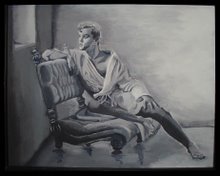
We're about to enter what some art instruction books call "the ugly phase". So, prepare yourself. This part always scares me. I just have to think of it as the challenge to overcome while working toward a beautiful finished artwork. We've covered our figure in a base coat of local color. Basically, we've covered the skin with a light skin color. But, as the light touches our guy his basic skin color will change lighter and darker. We're going to make him start to "pop" off the page now. He looks very flat because he's all one color. To make him start to "pop" we'll add a warm color that will advance toward us, red, right? We'll take a big dollop of that base color we made up and starting adding a hint of cad red to it. When it turns noticebly pink we're ready to use it. Use the reference photo to find all the aread on our guy that is sun-kissed. All the bright areas and highlights get a stroke of this color. Add the glow of health and fitness to him. We'll not cover all of him with this color, especially not the shadow areas. We also want that golden skin tone to peek through here and there. It's more interesting that way, I think.
So, now we go back to the shadows again. We can see them under the skin color because we underpainted them maroon, remember? I'm not one to rush into things too quickly. That's the conservative, non-risk taker in me. I'd hate to get too eager with my color selections and ruin everything I've done up to this point. So, we're going to make a gradual progression toward our shadow areas. Some people might think to create a shadow color would mean to mix up a darker color of skin tone and paint the dark spots. But, that's boring. We don't just see shades of light and dark. We see change in color and changes in temperature. His shadowed areas are not just darker, they're cooler. Cooler colors also change color, they change hue not just change value. I'm going to be bold and choose a cool color. We'll go back to that dark neutral we created for the background and put a big dollop of it into a new area. Begin adding white gesso until it turns about fifty percent gray. I see that this truly is gray and has little temperature to it at all. So, I add a touch of blue until we have a pretty steel blue, or cadet blue as it used to say in the Crayola crayon box. This is going to help harmonize our color scheme. The parent of this shadow color is the same as the dark cast shadow color in the background. It's also very close to the same hue as our blue-gray background. See, there's method to my madness. Color harmony is one of the principles of design. We'll lightly paint the shadows with this color. I work very gradually and keep an old, clean brush handy. After I paint a small area I use the clean brush to gently blend and soften this color as I apply it. I want to start to eliminating my hard edges. Take several breaks to step back and look at him from a distance. Is he starting to lift off the page a little? I hope so. Let's not do too much with this shadow color. We can always add more. It's harder to cover up or take away.
Give the floor he's standing on just a little texture and we're done with this step. I notice that I've lost some of the edges I wanted to keep and I've really lost the face. So, before it's too covered I take a colored pencil and bring those lines and edges back into focus so I can see what I'm doing. I'm gonna cover this guy with another coat of matte varnish. Acrylics have the bad habit of turning loose when you paint several thin layers. The varnish helps lock things down in between layers so we can keep working without worrying about that. Now, let's set him on a bright shelf in the living room and live with him for a while so he can tell us what he needs next. Mist and cover the paints so they don't dry out. Let's watch TV with him for a while.


No comments:
Post a Comment