

I hope that you read an article I wrote a few months back about the great American illustrator J.C. Leyendecker. I love his work and would like very much to be able to create work in that style.
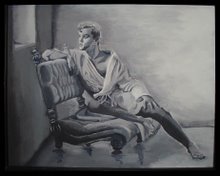
After painting the "Pink Trunks" man I was very disappointed. I felt as if I had started out with a good idea but got further and further away from the original composition I had planned. The original idea was to work in a very soft and transparent style. I wanted a very romanticized and atmospheric piece of artwork. Instead, my piece was very hard and sculptural and solid. I think the end product was one hundred percent the opposite of the style I planned to create.
While the result was unintended I have to admit that its not unappealing. There are some strong points about this piece. The balance and symmetry of the figure is good. The treatment of light, shadow, highlight, reflected light, and skin tones are appropriate. But, why did I lean in this direction? I thought about what my personal tastes in figurative art were. I tried to remember what influenced me. My first love of art was the Renaissance master works of Michelangelo and Da Vinci. The sculpture of Michelangelo and Bernini. So, is there any wonder why my work might have that very modeled and sculptural look to it.
I've also just been reading a book about the great American illustrators, Maxfield Parrish, Norman Rockwell, and his mentor J.C. Leyendecker. I found some illustrations by Leyendecker and was struck by a few similarities between his work and mine. First of all, there is the very statuesque and stylized rendering of the figure. Secondly, I noticed the cool bluish reflected light on the legs. And finally, I see the strong, almost polished quality of the highlights on the skin.
Am I suggesting that my work matches the quality of Leyendecker? Absolutely not. I'm analyzing this piece with as much modesty as I can muster. But, I am trying to convince myself that the aesthetic that I achieved is one that has been previously demonstrated and widely appreciated in another era. It can't be denied that the beautiful male figures in Leyendecker's work were extremely stylized and decorative. He wasn't trying to show those men as hardworking All-American athletes. He was blatantly celebrating a fantasized, idealized depiction of beautiful men. Apparently the publishers and readers of the Saturday Evening Post were celebrating right along with him.
Am I suggesting that my work matches the quality of Leyendecker? Absolutely not. I'm analyzing this piece with as much modesty as I can muster. But, I am trying to convince myself that the aesthetic that I achieved is one that has been previously demonstrated and widely appreciated in another era. It can't be denied that the beautiful male figures in Leyendecker's work were extremely stylized and decorative. He wasn't trying to show those men as hardworking All-American athletes. He was blatantly celebrating a fantasized, idealized depiction of beautiful men. Apparently the publishers and readers of the Saturday Evening Post were celebrating right along with him.
Leyendecker's athletes had a definite sensual vitality to them. They look waxed and ready to go onstage as Chippendale's dancers more than prepared for a rowing competition. Yet, in the 1930's this image had a certain innocence to it. In that day and age these figures could be admired as beautiful without being overtly sexual. If the same type of cover were on a magazine today it wouldn't be a painting. It would feature a photograph of near naked sweaty fitness models. Where's the "art" in that? When put that way, I'm proud to have painted a piece that reflects Leyendecker's style.


1 comment:
I think you should be proud. I find the image an engaging one. It does look polished rather than atmospheric, however I recognise him, I've seen him, met him, know him.
Check out my artwork.
http://share-my-art.blogspot.com/
Paul
Thank you, can I link to your site on mine?
Post a Comment